Confidence Intervals in SQL, when no real mathematicians are looking
Our business issue
Often times we want to display confidence intervals for a proportion/probability (i.e. a percentage between 0% and 100%) in a report or dashboard.
For example, in an eCommerce setting we may want to show exchange rates of products (expressed as $\frac{exchanges}{orders}$) from week to week. However, since we don’t really know the true exchange rate of our customer population at large, each week represents a sample, if you will, drawn from the distribution of exchange rates for our business. Thus, because of the stochastic nature of weekly sales pattern, comparing exchange rates across weeks requires that we take the sample size of each weekly purchase cohort into account.
As a result, exchange rates for weeks with lower overall sales volume have higher implied sampling error than weeks with high purchase volume.
While tools like Python, R or even Excel can help us here, we don’t always have the luxury of computing them using a statistical package like R or scipy, so we’ll also explore an alternative using SQL.
Proportions as a Beta distribution
Empirically, a ratio like exchange rate follows a \(beta\) distribution, which is often used to describe probabilities such as % heads in a coin toss, or % clicked in an online A/B testing scenario. We can think of the exchange rate as the probability of getting an exchange out of all possible tries (sales).
Using the canonical coin toss example, let’s see what a \(beta\) distribution looks like in R, by parameterizing a \(beta\) random variable using $\alpha$ and $\beta$, representing heads and tails, respectively.
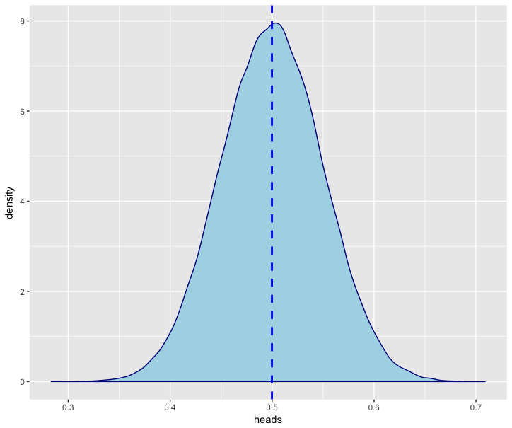
We’ll simulate 100,000 tosses of a fair coin and draw the resulting distribution of values:
library(ggplot2)

simulations = 100000

trials = 100
heads = 50

alpha = heads
beta = trials - heads

coin_toss_sim = rbeta(simulations, alpha, beta)

df = data.frame(heads=coin_toss_sim)

p = ggplot(df, aes(x=heads)) + geom_density(color="darkblue", fill="lightblue")
p + geom_vline(aes(xintercept=mean(heads)), color="blue", linetype="dashed", size=1)
)

We’ll note that a 50/50 distribtution of coin tosses is centered around 0.50 and looks quite symmetrical, meaning there seems to be an even amount of probability that a fair coin tossed 100 times comes up heads more or less than 50 of the time.
Even without simulation, we can calculate confidence intervals for a \(beta\) distribution quite easily using R or even Excel / Google Sheets:
R:
Using the built-in qbeta() function to extract quantiles from the \(beta\) distribution,
we compute a 95% confidence interval for a \(beta\) distribution centered around 50%, where we’ve observed 50 heads out of 100 coin tosses:
heads = 50
tails = 50
p = (1-0.95)/2
# Lower Bound
lb = qbeta(p, heads, tails)

# Median
md = qbeta(0.5, 50, 50)

# Upper Bound
ub = qbeta(1-p, heads, tails)

c(lb, md, ub)
[1] 0.4026979 0.5000000 0.5973021
This tells us that tossing a coin 100 times, there’s a 95% chance that it’ll come up heads between 40 and ~60 times.
Excel/Google Sheets:
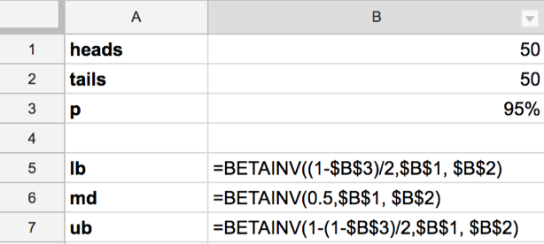
Here we can use the built-in BETAINV() formula to extract quantiles from a parameterized \(beta\) distribution:
E.g.

lb =BETAINV(0.025, 50, 50)
md =BETAINV(0.5, 50, 50)
ub =BETAINV(0.975, 50, 50)
lb	0.4026979
md	0.50
ub	0.5973021
We confirm that those are the same results as we got from our R experiment earlier.
Let’s turn back to the original business problem we presented earlier - how to calculate confidence intervals for something like a weekly exchange rate of orders.
But what about if the only tool at our disposal is good old SQL?
Since SQL (generally) lacks a built-in way to access \(beta\) distribution values, we turn to the Central Limit Theorem for help and use a \(Normal\) approximation of the \(beta\) distribution, provided our sample is sufficiently large.
Using the normal approximation, we can express a confidence internal given \(p\) and \(n\) like this:
\[\hat{p} \pm z \sqrt \frac{\hat{p}(1-\hat{p})}{n}\](where \(n\) is the sample size for the period we’re looking at and $\hat{p}$ is the proportion we’re reporting, with $z$ as our z-score, e.g. 1.96 to represent a 95% CI)
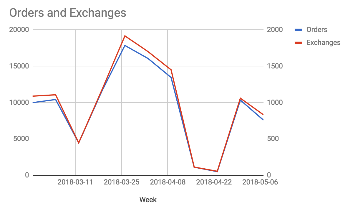
Given that we have data for exchange rates in tabular form like so:
my_order_and_exchanges_table
| Week | Orders | Exchanges |
|---|---|---|
| 2018-02-25 | 10000 | 1089 |
| 2018-03-04 | 10431 | 1108 |
| 2018-03-11 | 4472 | 447 |
| 2018-03-18 | 11567 | 1172 |
| 2018-03-25 | 17864 | 1918 |
| 2018-04-01 | 16078 | 1702 |
| 2018-04-08 | 13459 | 1451 |
| 2018-04-15 | 1122 | 114 |
| 2018-04-22 | 515 | 56 |
| 2018-04-29 | 10349 | 1061 |
| 2018-05-06 | 7595 | 832 |
 (Orders on left y-axis, Exchanges on right y-axis)
We can then create approximate confidence intervals in SQL as follows:
-- We'll first aggregate our order and exchange data to a weekly level
with exchange_rate as (

    select
        f.week,
        sum(f.orders) as orders,
        sum(f.exchanges) as exchanges,
        sum(f.exchanges)::float/sum(f.orders) as exchange_rate
    from
        my_order_and_exchanges_table f
    group by 1

),
-- then we compute the implied error for each week
exchange_rate_error as (

    select
        e.*,
        -- Normal approximation to Beta distribution standard deviation, see:
        -- https://en.wikipedia.org/wiki/Binomial_proportion_confidence_interval
        -- 		sqrt( p * (1 - p) / n )
        sqrt(e.exchange_rate * (1 - e.exchange_rate)/e.orders) as exchange_rate_se
    from
        exchange_rate e

),
-- as an extension, we'll add a table of z-scores
-- for different confidence intervals we may want to compute
z_values as (

    select  1.65 as z_value, '90% CI' as z_value_name
    union all
    select  1.96 as z_value, '95% CI' as z_value_name

)
-- We then apply each z-value to the implied error and subtract/add it
-- from the exchange rate to get a lower/upper bound
select
    z.z_value_name,
    s.*,
    -- lower bound at 0
    greatest(
        s.exchange_rate - z.z_value * s.exchange_rate_se
    , 0) as exchange_rate_lb,
    s.exchange_rate + z.z_value * s.exchange_rate_se as exchange_rate_ub
from
    exchange_rate_error s,
    z_values z
order by
    z.z_value_name,
    s.week
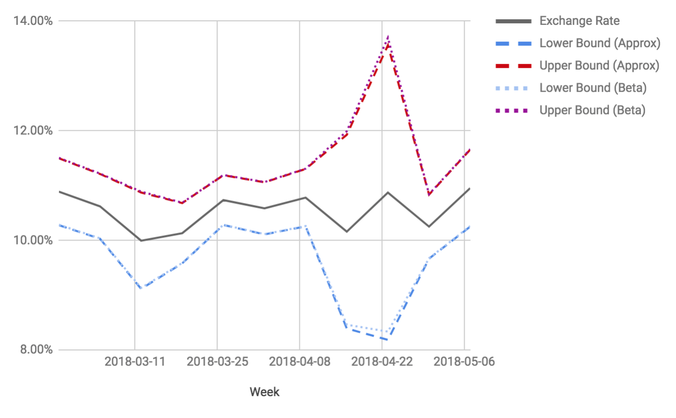
Plotting this against the exchange rate given by orders and exchanges from above, we can see that the upper and lower bounds of our approximated confidence interval, here plotted as a Bollinger Band, neatly track the upper & lower bounds computed from exact quantiles drawn from the \(beta\) distribution:

Note though that in the week of 2018-04-22, where our order volume dropped off drastically, the confidence interval is noticeably larger, while the approximation deviates the most from the exact confidence interval. In cases like this, where our sample size gets small, the normal approximation does not hold up as well anymore.

Comments