Confidence Intervals, when no real mathematicians are looking - Tableau Edition
Updated: this post now includes instructions and an example Tableau workbook on creating barbell/dumbbell charts.
In our last post, we discussed calculating approximate confidence intervals for proportions in SQL when we don’t have access to statistical distributions, like the \(beta\) distribution. If you haven’t read that one yet, I recommend you head over there now to get more context on what we’re trying to do.
As we saw, calculating this approximation in SQL is helpful, for example, when we need to use this confidence interval in downstream data pipelines or models. Many times though, we just want to display the confidence interval on a dashboard in our BI tool of choice, e.g. in Tableau. In that case, it’d be better if we could dynamically calculate the CI in our BI tool.
Turns out we can apply the same technique as in the earlier post to accomplish just that. We’ll use Tableau to illustrate how to do this, but most other BI tools that allow you to create custom formulas in your metric (e.g. MicroStrategy) would work here.
The Data
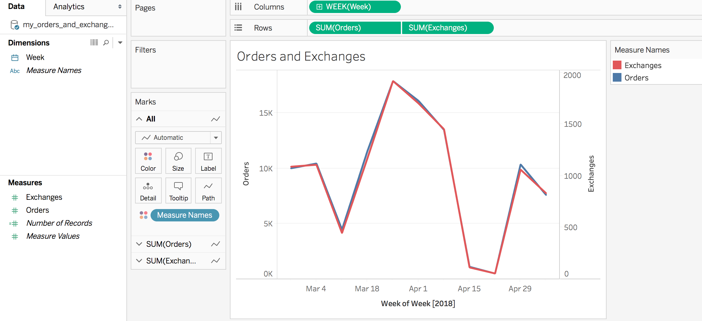
We’ll reuse the sample dataset we used last time, but this time we use Tableau to analyze it.
my_order_and_exchanges_table
| Week | Orders | Exchanges |
|---|---|---|
| 2018-02-25 | 10000 | 1089 |
| 2018-03-04 | 10431 | 1108 |
| 2018-03-11 | 4472 | 447 |
| 2018-03-18 | 11567 | 1172 |
| 2018-03-25 | 17864 | 1918 |
| 2018-04-01 | 16078 | 1702 |
| 2018-04-08 | 13459 | 1451 |
| 2018-04-15 | 1122 | 114 |
| 2018-04-22 | 515 | 56 |
| 2018-04-29 | 10349 | 1061 |
| 2018-05-06 | 7595 | 832 |

We’ll create a new calculated field called Exchange Rate % using the following formula, making sure to apply default percent style formatting.
SUM([Exchanges])/SUM([Orders])
Summing the numerator and the denominator before we divide the two makes sure we can correctly aggregate the metric if needed (otherwise we’d be summing the weekly exchange rates).
We note that the exchange rate % is pretty stable between 10 and 11%.

However, as we know from last time, we should take that with a slight grain of salt, and apply a confidence interval around this measurement to account for the varying levels of order volume from week to week.
To do that, we’ll create a few more calculated fields to mirror the calculations we did in SQL in our last post.
First, we define the standard error metric Exchange Rate % SE (again, using the Normal Approximation):
SQRT(
    [Exchange Rate %] *
    (1 - [Exchange Rate %])/SUM(Orders)
)
Then using 1.96 as our z-value of choice (for a 95% confidence interval), we create metrics for the upper and lower bounds, like so:
Exchange Rate % (Lower Bound)
[Exchange Rate %]-1.96*[Exchange Rate % SE]
Exchange Rate % (Upper Bound)
[Exchange Rate %]+1.96*[Exchange Rate % SE]
If we’re feeling fancy, we might even make the z-value a parameter in Tableau and use that instead, e.g.
[Exchange Rate %]+[Z-Value]*[Exchange Rate % SE]
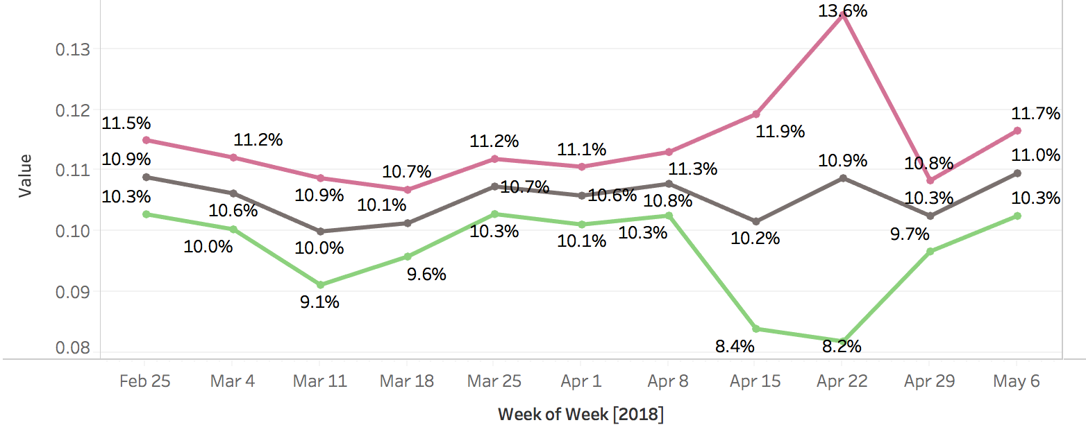
Plotting all three shows us, again, that the low order volume during the week of April 22 should make us more suspicious in trusting the exchange rate for that week. If you’re seeing spikes or drops in your ratio metrics, it’s always helpful to look at them in the context of overall volume to guard against reacting to noise in your weekly sample.

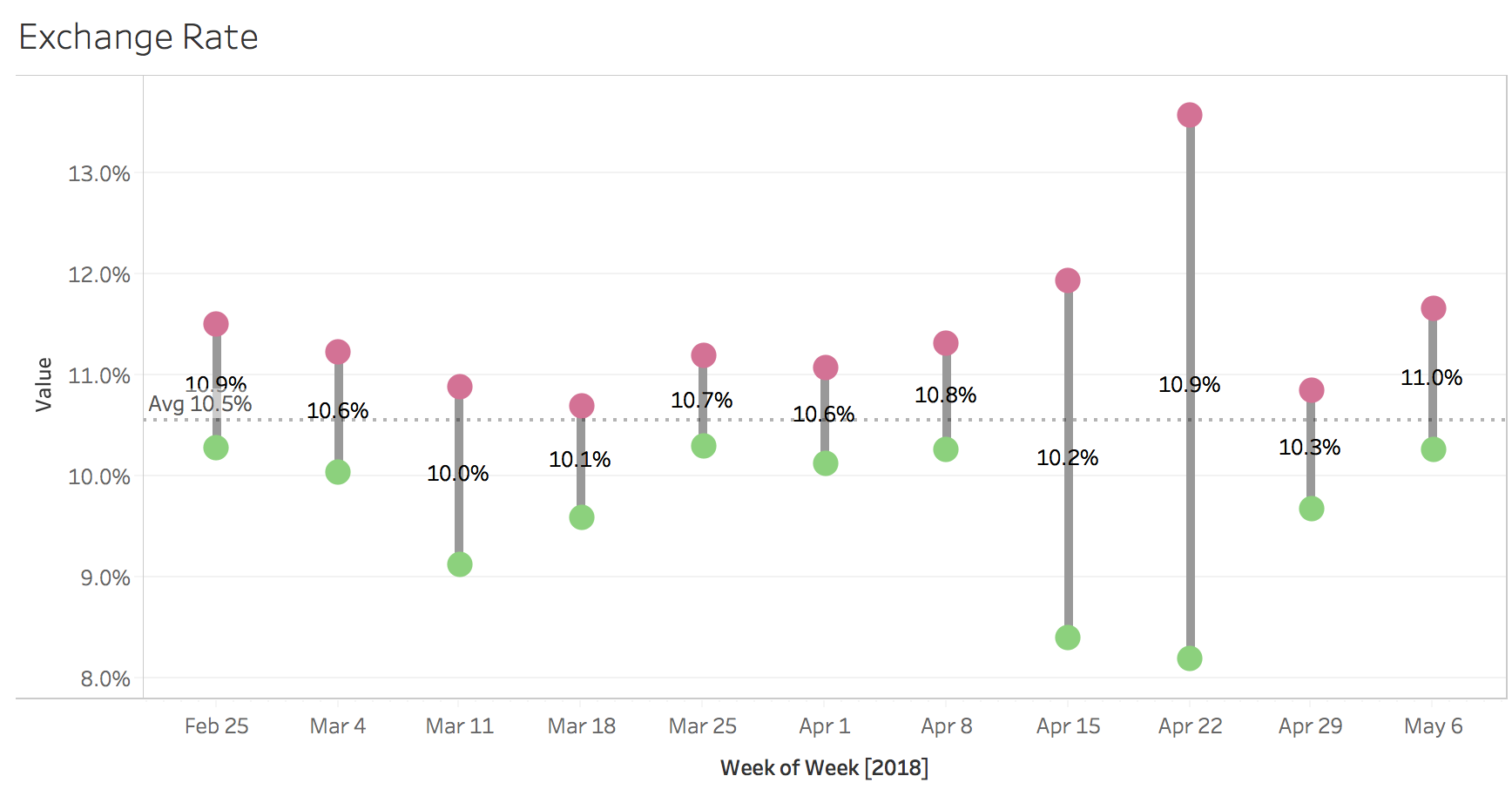
A nicer way to visualize these confidence bounds are so-called barbell, or dumbbell charts:

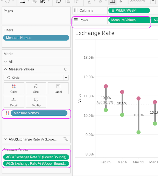
To create those using Tableau, we need to do the following:
- Create a new metric called
Exchange Rate % Range, simply calculating the difference between Upper and Lower Bounds,[Exchange Rate % (Upper Bound)] - [Exchange Rate % (Lower Bound)] - Add
Exchange Rate % (Lower Bound)andExchange Rate % (Upper Bound)as circles to the left y-axis.

- Add the
Exchange Rate % (Lower Bound)metric to a second y-axis on the right as a Gannt Chart - Add the newly created
Exchange Rate % Rangemetric to the size button. This should result in vertical bars the height of the width of the CI.

- Right-click on the second y-axis and click on
Synchronize Axis, then unselectShow Header - Lastly, add the
Exchange Rate %metric to the Text button for the Gannt chart, which will show the average Exchange Rate in the center of the CO.
You can download a finished example of the Tableau workbook here.

Comments